Table of Contents
- I. Getting Started
- II. Source Code Highlight
- III. Text Formatting
- IV. Delimited Blocks
- V. Paragraphs
- VI. Document Structure
- VII. Callouts
- VIII. Macros
- IX. Customizing
List of Figures
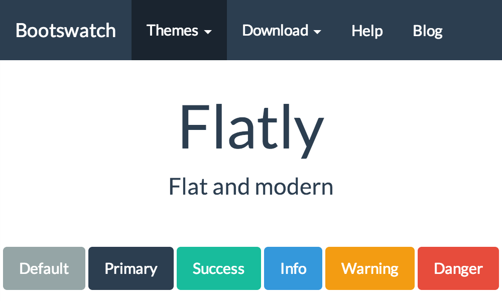
- 1.1. Basic Flatly theme
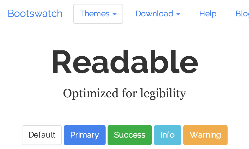
- 1.2. Basic Readable theme
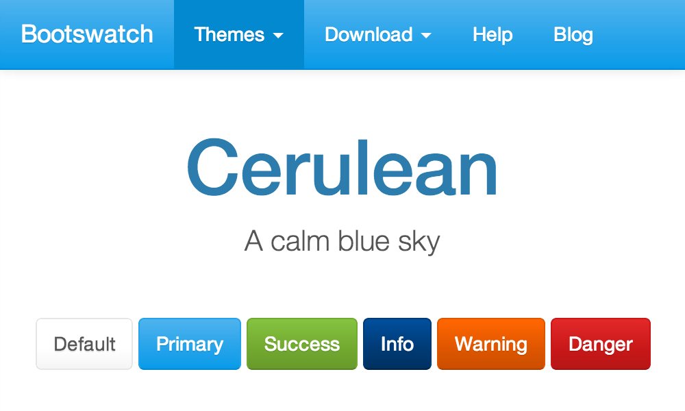
- 1.3. Basic Cerulean theme
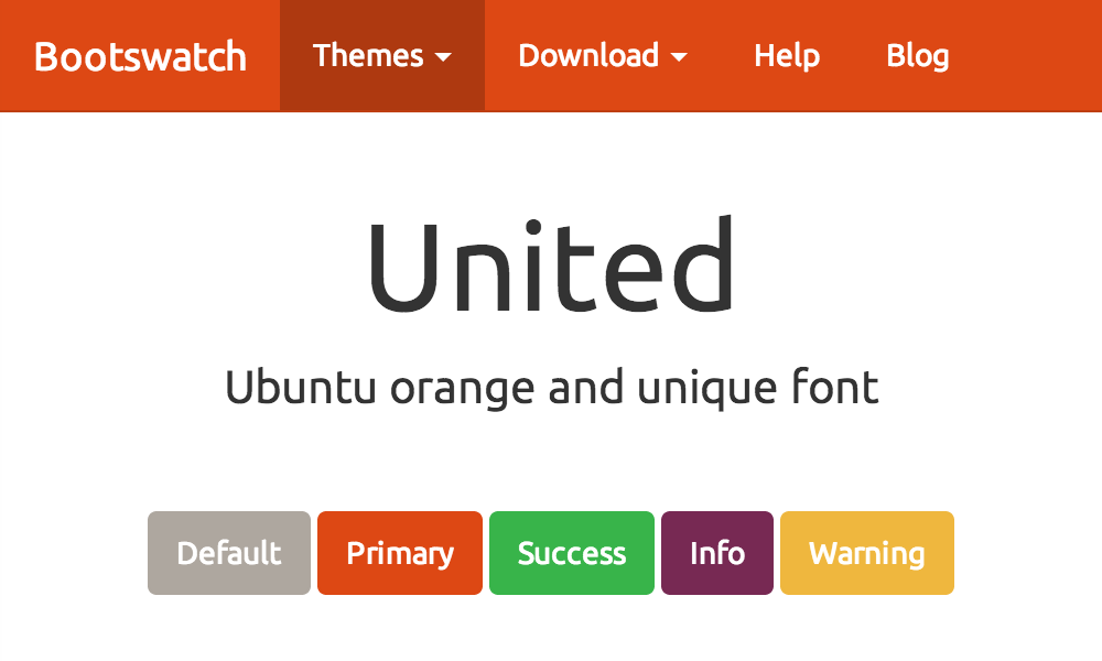
- 1.4. Basic United theme
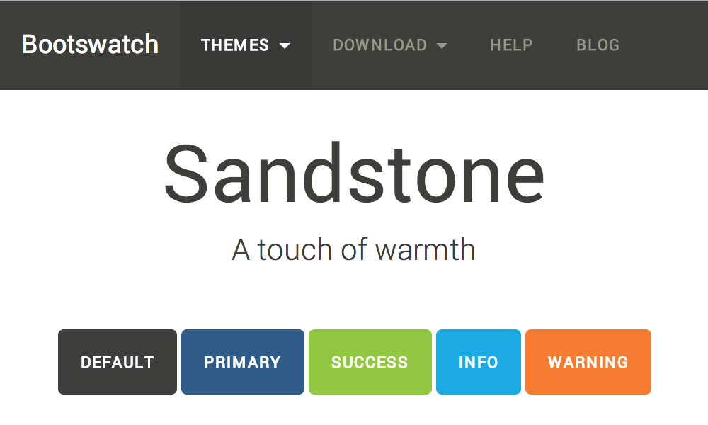
- 1.5. Basic Sandstone theme
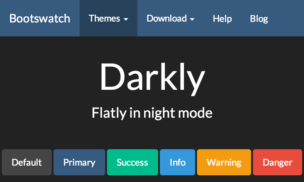
- 1.6. Basic Darkly theme
List of Examples
- 8.1. With
primarycontextual state class - 8.2. With
successcontextual state class - 8.3. With
warningcontextual state class - 8.4. With
infocontextual state class - 8.5. With
successcontextual state class - 8.6. With
warningcontextual state class - 9.1. Panel without heading
- 9.2. Panel with heading
- 9.3. Panel with primary contextual state class
- 9.4. Panel with success contextual state class
- 9.5. Panel with info contextual state class
- 9.6. Panel with warning contextual state class
- 9.7. Panel with danger contextual state class
- 10.1. Alert with success contextual state class
- 10.2. Alert with info contextual state class
- 10.3. Alert with warning contextual state class
- 10.4. Alert with danger contextual state class
- 10.5. Alert with contextual state class
This complete guide documents AsciiDoc-Bootstrap 4.5.0, published on 2015-06-15.
This work is licensed under the Attribution-Share Alike 3.0 Unported license.
- Uncompressed, Minified CSS and Javascripts, and Fonts. Source files are included but without html documentation.
- User documentation built with AsciiDoc-Boostrap backend and the default theme is available to read it offline.
Install as any other plugins:
$ asciidoc --backend install bootstrap-<version>.zip
![[Note]](images/icons/note.png) | |
|
| |
The Asciidoc Bootstrap backend standard version included :
|
AsciiDoc-Bootstrap backend v4 standard distribution included these following templates with pre-compiled CSS (uncompressed and/or minified) and default behavior :
- Admonition blocks used Font-Awesome icons font
- Support both Glyphicon, Font-Awesome, Ionicons and Octicons icons font
When you will installed the asciidoc bootstrap backend, you will find the following file structure and contents.
 bootstrap/
  ├── bootstrap/
  │   ├── css/
  │   ├── fonts/
  │   └── js/
  ├── docs/
  ├── fonts/
  ├── images/
  │   ├── icons/
  │   │   ├── callouts/
  │   │   ├── ui.totop.png
  │   │   └── favicon.ico
  ├── javascripts/
  │   ├── asciidoc.js
  │   ├── html5shiv.js
  │   ├── html5shiv.min.js
  │   ├── jquery.bootstrapThemeSwitcher.js
  │   ├── jquery.cookie.js
  │   ├── jquery.js
  │   ├── jquery.min.js
  │   ├── jquery.mmenu.min.all.js
  │   ├── jquery.tableofcontents.min.js
  │   ├── jquery.ui.totop.js
  │   ├── jquery.ui.totop.min.js
  │   ├── respond.js
  │   └── respond.min.js
  ├── less/
  │   ├── asciidoc/
  │   │   ├── admonition-iconsfont.less
  │   │   ├── admonition-text.less
  │   │   ├── common.less
  │   │   ├── iconsfont.less
  │   │   └── pygments.less
  │   ├── bootstrap/
  │   ├── font-awesome/
  │   ├── ionicons/
  │   ├── octicons/
  │   ├── asciidoc-bootstrap.less
  │   └── variable.less
  ├── stylesheets/
  │   ├── asciidoc-bootstrap.cerulean.css
  │   ├── asciidoc-bootstrap.cerulean.min.css
  │   ├── asciidoc-bootstrap.darkly.css
  │   ├── asciidoc-bootstrap.darkly.min.css
  │   ├── asciidoc-bootstrap.css
  │   ├── asciidoc-bootstrap.min.css
  │   ├── asciidoc-bootstrap.flatly.css
  │   ├── asciidoc-bootstrap.flatly.min.css
  │   ├── asciidoc-bootstrap.readable.css
  │   ├── asciidoc-bootstrap.readable.min.css
  │   ├── asciidoc-bootstrap.united.css
  │   ├── asciidoc-bootstrap.united.min.css
  │   ├── asciidoc-bootstrap.sandstone.css
  │   ├── asciidoc-bootstrap.sandstone.min.css
  │   ├── jquery.mmenu.all.css
  │   ├── pygments.css
  │   ├── pygments.monokai.css
  │   ├── pygments.pastie.css
  │   └── ui.totop.css
  └── themes
      ├── cerulean/
      ├── darkly/
      ├── default/
      ├── flatly/
      ├── readable/
      ├── sandstone/
└── united/Head to the docs sections for more information and examples.
The Pygments syntax highlighter can be used for xhtml11, html5 and bootstrap outputs.
| |
Since version 3.1.0 you have ability to use any of the Pygments 1.5 themes provided at document build time. |
Words and phrases can be formatted by enclosing inline text with quote characters.
Delimited blocks are blocks of text enveloped by leading and trailing delimiter lines
Paragraphs are blocks of text terminated by a blank line, the end of file, or the start of a delimited block or a list. There are three paragraph syntaxes: normal, indented (literal) and admonition which are rendered, by default, with the corresponding paragraph style.
AsciiDoc has two mechanisms for optionally including additional meta-data in the header of the output document.
Like the docinfo attribute, bootstrap backend add support to dropdowns
navigation bar with to new navinfo attribute.
It also add support to bootstrap jumbotron component with the new jumboinfo attribute.
Callouts are a mechanism for annotating verbatim text (for example: source code, computer output and user input). Callout markers are placed inside the annotated text while the actual annotations are presented in a callout list after the annotated text.
Macros are a mechanism for substituting parametrized text into output documents.
Macros have a name, a single target argument and an attribute list.
Inline Macros occur in an inline element context. Predefined Inline macros include image and link macros.
AsciiDoc-Bootstrap v4 includes support of LESS one of the most popular CSS preprocessor.
Easy to maintain, and change skins of your favorite Asciidoc documents.
The Pygments syntax highlighter can be used
for xhtml11, html5 and bootstrap outputs (set the source-highlighter attribute to pygments).
Until now, AsciiDoc allow only to use Pygments with a default theme that look like to emacs theme.
We have no way to customize this at document build time, unless editing contents of ./stylesheets/pygments.css file.
AsciiDoc-Bootstrap backend introduce in version 3.1.0 the new attribute pygments-style
to change Pygments stylesheet at document build time.
| |
Credit to AsciiDoctor GH-637 issue. |
By default, AsciiDoc-Bootstrap used the AsciiDoc pygments theme. To change the style,
set the pygments-style attribute and assign it the alternate style’s name.
![[Tip]](images/icons/tip.png) | |
To see what pygments styles you have available, open a terminal and type: $ pygmentize -L styles It will output the style names and brief descriptions. Pygments 1.5 provides 19 themes, but only 3 pre-defined stylesheets are available in standard AsciiDoc-Bootstrap backend distribution (default, pastie, monokai). Here are how to setup other themes. Open a terminal and type: $ pygmentize -f html -S <theme> -a .highlight where |
In the example document below, we used the monokai style as main theme,
and pastie as local theme to highlight a block of CSS code.
![[Caution]](images/icons/caution.png) | |
Pygments token |
| |
The source-highlighter |
== Alternate Pygments Theme
:source-highlighter: pygments
:pygments-style: monokai

[source,php,numbered]
.Using global theme [label label-default]#{pygments-style}#
----
<?php
use Symfony\Component\Finder\Finder;

$finder = new Finder();
$finder->files()->in(__DIR__);

foreach ($finder as $file) {
    // affiche le chemin absolu
    print $file->getRealpath()."\n";
    // affiche le chemin relatif d'un fichier, sans le nom du fichier
    print $file->getRelativePath()."\n";
    // affiche le chemin relatif du fichier
    print $file->getRelativePathname()."\n";
}
----


[source,css]
.Using local theme [label label-default]#{local-css-style}#
----
/*
|--------------------------------------------------------------------------
| UItoTop jQuery Plugin 1.2
| http://www.mattvarone.com/web-design/uitotop-jquery-plugin/
|--------------------------------------------------------------------------
*/

#toTop {
        display:none;
        text-decoration:none;
        position:fixed;
        bottom:10px;
        right:10px;
        overflow:hidden;
        width:51px;
        height:51px;
        border:none;
        text-indent:100%;
        background:url(../images/icons/ui.totop.png) no-repeat left top;
}

#toTopHover {
        background:url(../images/icons/ui.totop.png) no-repeat left -51px;
        width:51px;
        height:51px;
        display:block;
        overflow:hidden;
        float:left;
        opacity: 0;
        -moz-opacity: 0;
        filter:alpha(opacity=0);
}

#toTop:active, #toTop:focus {
        outline:none;
}
----
Renders
Using global theme monokai.
<?php
use Symfony\Component\Finder\Finder;

$finder = new Finder();
$finder->files()->in(__DIR__);

foreach ($finder as $file) {
    // affiche le chemin absolu
    print $file->getRealpath()."\n";
    // affiche le chemin relatif d'un fichier, sans le nom du fichier
    print $file->getRelativePath()."\n";
    // affiche le chemin relatif du fichier
    print $file->getRelativePathname()."\n";
}
/*
|--------------------------------------------------------------------------
| UItoTop jQuery Plugin 1.2
| http://www.mattvarone.com/web-design/uitotop-jquery-plugin/
|--------------------------------------------------------------------------
*/

#toTop {
        display:none;
        text-decoration:none;
        position:fixed;
        bottom:10px;
        right:10px;
        overflow:hidden;
        width:51px;
        height:51px;
        border:none;
        text-indent:100%;
        background:url(../images/icons/ui.totop.png) no-repeat left top;
}

#toTopHover {
        background:url(../images/icons/ui.totop.png) no-repeat left -51px;
        width:51px;
        height:51px;
        display:block;
        overflow:hidden;
        float:left;
        opacity: 0;
        -moz-opacity: 0;
        filter:alpha(opacity=0);
}

#toTop:active, #toTop:focus {
        outline:none;
}A sidebar is a short piece of text presented outside the narrative flow of the main text. The sidebar is normally presented inside a bordered box to set it apart from the main text.
.An Example Sidebar
************************************************
Any AsciiDoc SectionBody element (apart from
SidebarBlocks) can be placed inside a sidebar.
************************************************
Renders:
You may also used the attribute role to control padding and rounded corners.
With well-sm role:
.An Example Sidebar
[role="well-sm"]
****
Any AsciiDoc SectionBody element (apart from
SidebarBlocks) can be placed inside a sidebar.
****
Renders:
With well-lg role:
.An Example Sidebar
[role="well-lg"]
****
Any AsciiDoc SectionBody element (apart from
SidebarBlocks) can be placed inside a sidebar.
****
Renders:
Open blocks are special: they are used to generate document abstracts, book part introductions and more.
![[Warning]](images/icons/warning.png) | |
Previous version 3, used it to simulate multi columns. Version 4 dropped this behavior.
Don’t be afraid, this feature is still possible using the standard Bootstrap classes like |
First open block structure is used to implement the Bootstrap Panel Component.
See Chapter 9, Panels Bootstrap Component to learn how AsciiDoc-Bootstrap backend implements this feature
Second open block structure is used to implement the Bootstrap Alert Component.
Example 8.4. With info contextual state class
This alert needs your attention, but it’s not super important.
See Chapter 10, Alerts Bootstrap Component to learn how AsciiDoc-Bootstrap backend implements this feature
While not always necessary, sometimes you need to put your DOM in a box. For those situations, try the panel component.
By default, all the .panel does is apply some basic border and padding to contain some content.
Html Code.
<div class="panel panel-default">
  <div class="panel-body">
    Basic panel example
  </div>
</div>
AsciiDoc Code.
[panel]
--
Basic panel example
--
Easily add a heading container to your panel with .panel-heading
Html Code.
<div class="panel panel-default">
  <div class="panel-heading">
    Panel title
  </div>
  <div class="panel-body">
    Panel content
  </div>
</div>
AsciiDoc Code.
[panel]
.Panel title
--
Panel content
--
Like other components, easily make a panel more meaningful to a particular context by adding any of the contextual state classes.
Html Code.
<div class="panel panel-primary">
  <div class="panel-heading">
    <h3 class="panel-title">Panel title</h3>
  </div>
  <div class="panel-body">
    Panel content
  </div>
</div>
AsciiDoc Code.
[panel,primary]
.Panel title
--
Panel content
--
Html Code.
<div class="panel panel-success">
  <div class="panel-heading">
    <h3 class="panel-title">Panel title</h3>
  </div>
  <div class="panel-body">
    Panel content
  </div>
</div>
AsciiDoc Code.
[panel,success]
.Panel title
--
Panel content
--
Html Code.
<div class="panel panel-info">
  <div class="panel-heading">
    <h3 class="panel-title">Panel title</h3>
  </div>
  <div class="panel-body">
    Panel content
  </div>
</div>
AsciiDoc Code.
[panel,info]
.Panel title
--
Panel content
--
Html Code.
<div class="panel panel-warning">
  <div class="panel-heading">
    <h3 class="panel-title">Panel title</h3>
  </div>
  <div class="panel-body">
    Panel content
  </div>
</div>
AsciiDoc Code.
[panel,warning]
.Panel title
--
Panel content
--
Html Code.
<div class="panel panel-danger">
  <div class="panel-heading">
    <h3 class="panel-title">Panel title</h3>
  </div>
  <div class="panel-body">
    Panel content
  </div>
</div>
AsciiDoc Code.
[panel,danger]
.Panel title
--
Panel content
--
Behind the scene
Build this {docfile} [1]
| |
See [2] for |
with :
- html5 backend
$ asciidoc.py
  -b html5
  -a linkcss
  -a stylesdir=./stylesheets
  -a scriptsdir=./javascripts
{docfile} | |
You will have tons of WARNING because AsciiDoc does not support the |
asciidoc: WARNING: panels.asciidoc: line 40: missing style: [blockdef-open]: panel
asciidoc: WARNING: panels.asciidoc: line 78: missing style: [blockdef-open]: panel
asciidoc: WARNING: panels.asciidoc: line 116: missing style: [blockdef-open]: panel
asciidoc: WARNING: panels.asciidoc: line 151: missing style: [blockdef-open]: panel
asciidoc: WARNING: panels.asciidoc: line 186: missing style: [blockdef-open]: panel
asciidoc: WARNING: panels.asciidoc: line 221: missing style: [blockdef-open]: panel
asciidoc: WARNING: panels.asciidoc: line 256: missing style: [blockdef-open]: panel
- bootstrap backend
$ asciidoc.py
  -b bootstrap
  -a linkcss
  -a stylesdir=./stylesheets
  -a scriptsdir=./javascripts
  -a theme=flatly
  -a navbar=fixed
  -a totop
{docfile} | |
You will have a WARNING because the theme used (e.g. flatly) is a Bootswatch theme, and not a AsciiDoc Theme. |
asciidoc: WARNING: missing theme: flatly
Provide contextual feedback messages for typical user actions with the handful of available and flexible alert messages.
| |
Alerts don’t have default classes, only base and modifier classes. A default gray alert doesn’t make too much sense, so you’re required to specify a type via contextual class. Choose from success, info, warning, or danger. |
AsciiDoc Code.
[alert,success]
.Well done!
--
You successfully read this important alert message.
--
Example 10.1. Alert with success contextual state class
You successfully read this important alert message.
AsciiDoc Code.
[alert,info]
.Heads up!
--
This alert needs your attention, but it's not super important.
--
Example 10.2. Alert with info contextual state class
This alert needs your attention, but it’s not super important.
AsciiDoc Code.
[alert,warning]
.Warning!
--
Better check yourself, you're not looking too good.
--
Example 10.3. Alert with warning contextual state class
Better check yourself, you’re not looking too good.
AsciiDoc Code.
[alert,danger]
.Oh snap!
--
Change a few things up and try submitting again.
--
Example 10.4. Alert with danger contextual state class
Change a few things up and try submitting again.
Build on any alert by setting an optional dismiss option (close button).
AsciiDoc Code.
[alert,warning,true]
.Warning!
--
Better check yourself, you're not looking too good.
--
Behind the scene
Build this {docfile} [3]
| |
See [4] for |
with :
- html5 backend
$ asciidoc.py
  -b html5
  -a linkcss
  -a stylesdir=./stylesheets
  -a scriptsdir=./javascripts
{docfile} | |
You will have tons of WARNING because AsciiDoc does not support the |
asciidoc: WARNING: alerts.asciidoc: line 35: missing style: [blockdef-open]: alert
asciidoc: WARNING: alerts.asciidoc: line 57: missing style: [blockdef-open]: alert
asciidoc: WARNING: alerts.asciidoc: line 79: missing style: [blockdef-open]: alert
asciidoc: WARNING: alerts.asciidoc: line 101: missing style: [blockdef-open]: alert
asciidoc: WARNING: alerts.asciidoc: line 126: missing style: [blockdef-open]: alert
- bootstrap backend
$ asciidoc.py
  -b bootstrap
  -a linkcss
  -a stylesdir=./stylesheets
  -a scriptsdir=./javascripts
  -a theme=flatly
  -a navbar=fixed
  -a totop
{docfile} | |
You will have a WARNING because the theme used (e.g. flatly) is a Bootswatch theme, and not a AsciiDoc Theme. |
asciidoc: WARNING: missing theme: flatly
TIP, NOTE, IMPORTANT, WARNING and CAUTION admonishment
paragraph styles are generated by placing NOTE:, TIP:,
IMPORTANT:, WARNING: or CAUTION: as the first word of the
paragraph.
Since version 1.2.0, admonitionblock used alert-block Twitter Bootstrap styles. With support of icons font, it’s now time to change the behavior and default styles.
To compare three render categories, we will use the same file source [5].
By default the AsciiDoc HTML backends generate text captions instead of admonition icon image links.
See Chapter 12, Admonition Paragraphs using text what it look like without images or icons font symbols.
By default the AsciiDoc HTML backends generate text captions instead of admonition icon image links.
To generate links to icon images define the icons attribute,
for example using the -a icons command-line option.
As AsciiDoc, this backend will have the same default behavior.
See Chapter 13, Admonition Paragraphs using icons images what it look like.
Since version 3.1.0, admonitionblock may optionally used icons font to draw icons.
To generate links to icons font symbols define the iconsfont attribute.
Remember that you can use any of icons font support by the backend.
-
Glyphicons - use
-a iconsfont=glyphicon -
Font-Awesome - use
-a iconsfont=font-awesome -
Ionicons - use
-a iconsfont=ionicons -
Octicons - use
-a iconsfont=octicons
See Chapter 14, Admonition Paragraphs using Icons Font what it look like with Font-Awesome.
NOTE: This is an example note.

[NOTE]
Alternatively, you can specify the paragraph admonition style explicitly using an AttributeList element.
Renders:
| |
This is an example note. |
| |
Alternatively, you can specify the paragraph admonition style explicitly using an AttributeList element. |
IMPORTANT: This is another example more important.
Renders:
![[Important]](images/icons/important.png) | |
This is another example more important. |
CAUTION: This is another example important but less.
Renders:
| |
This is another example important but less. |
[icon="./images/icons/example.png"]
NOTE: What lovely war.
Renders:
| |
What lovely war. |
[TIP]
.A TIP admonition block
=====================================================================
Qui in magna commodo, est labitur dolorum an. Est ne magna primis
adolescens.

. Fusce euismod commodo velit.
. Vivamus fringilla mi eu lacus.
  .. Fusce euismod commodo velit.
  .. Vivamus fringilla mi eu lacus.
. Donec eget arcu bibendum
  nunc consequat lobortis.
=====================================================================
Renders:
| A TIP admonition block |
|---|---|
Qui in magna commodo, est labitur dolorum an. Est ne magna primis adolescens.
|
If you want to modify the default render, either change the less/asciidoc/admonition-text.less source file,
and rebuild the asciidoc-bootstrap.css file,
or copy the CSS rules in a new CSS file (free name), and build your page ( AsciiDoc ) with attribute stylesheet.
| |
Your custom stylesheet MUST be located in the |
E.g:
$ asciidoc
  -b bootstrap
  -a linkcss
  -a stylesdir=./stylesheets
  -a scriptsdir=./javascripts
  -a theme=flatly
  -a stylesheet=admonition-text.css
  -a navbar=fixed
  -a totop
  {docfile}
Content of admonition-text.css.
@import url(user.css);

.admonition {
    /* bootstrap 3 .alert style */
    padding: 15px;
    margin-bottom: 21px;
    border: 2px solid transparent;
    border-radius: 4px;
}
.note {
    border-color: olive;
}
.tip {
    border-color: blue;
}
.warning {
    border-color: yellow;
}
.caution {
    border-color: fuchsia;
}
.important {
    border-color: red;
}
.note .icon {
    color: olive;
}
.tip .icon {
    color: blue;
}
.warning .icon {
    color: yellow;
}
.caution .icon {
    color: fuchsia;
}
.important .icon {
    color: red;
}
.admonition .icon {
    float: none;
    font-size: 1.33em;
}
.admonition .icon .title {
    margin: 0;
    text-transform: uppercase;
    background-color: #DDD;
    padding-left: 1em;
}
.admonition .content {
    padding-left: 0;
    padding-top: 0.5em;
    margin-left: 0;
    border-left: 0;
    border-top: 0;
    min-height: 0;
}
NOTE: This is an example note.

[NOTE]
Alternatively, you can specify the paragraph admonition style explicitly using an AttributeList element.
Renders:
| |
This is an example note. |
| |
Alternatively, you can specify the paragraph admonition style explicitly using an AttributeList element. |
IMPORTANT: This is another example more important.
Renders:
| |
This is another example more important. |
CAUTION: This is another example important but less.
Renders:
| |
This is another example important but less. |
[icon="./images/icons/example.png"]
NOTE: What lovely war.
Renders:
| |
What lovely war. |
[TIP]
.A TIP admonition block
=====================================================================
Qui in magna commodo, est labitur dolorum an. Est ne magna primis
adolescens.

. Fusce euismod commodo velit.
. Vivamus fringilla mi eu lacus.
  .. Fusce euismod commodo velit.
  .. Vivamus fringilla mi eu lacus.
. Donec eget arcu bibendum
  nunc consequat lobortis.
=====================================================================
Renders:
| A TIP admonition block |
|---|---|
Qui in magna commodo, est labitur dolorum an. Est ne magna primis adolescens.
|
If you want to modify the default render,
copy the CSS rules in a new CSS file (free name), and build your page ( AsciiDoc ) with attribute stylesheet.
| |
Your custom stylesheet MUST be located in the |
E.g:
$ asciidoc
  -b bootstrap
  -a linkcss
  -a stylesdir=./stylesheets
  -a scriptsdir=./javascripts
  -a theme=flatly
  -a stylesheet=admonition-images.css
  -a navbar=fixed
  -a totop
  {docfile}
Content of admonition-images.css.
.admonition {
    padding: 15px;
    margin-bottom: 21px;
    border: 0;
}
.note {
    background-color: olive;
}
.tip {
    background-color: blue;
}
.warning {
    background-color: yellow;
}
.caution {
    background-color: fuchsia;
}
.important {
    background-color: red;
}
.admonition .icon {
    float: left;
    font-size: 3em;
    background-color: transparent;
}
.admonition .icon .title {
    font-size: 1em;
    margin: 0;
}
.admonition .content {
    padding-left: 0.5em;
    margin-left: 4em;
    border-left: 3px solid #DDD;
    min-height: 4em;
    background-color: #DDD;
}
To use Font-Awesome icons font rather than PNG images,
build your AsciiDoc source files with attribute iconsfont - use -a iconsfont=font-awesome
NOTE: This is an example note.

[NOTE]
Alternatively, you can specify the paragraph admonition style explicitly using an AttributeList element.
Renders:
| |
This is an example note. |
| |
Alternatively, you can specify the paragraph admonition style explicitly using an AttributeList element. |
IMPORTANT: This is another example more important.
Renders:
| |
This is another example more important. |
CAUTION: This is another example important but less.
Renders:
| |
This is another example important but less. |
[icon="./images/icons/example.png"]
NOTE: What lovely war.
Renders:
| |
What lovely war. |
[TIP]
.A TIP admonition block
=====================================================================
Qui in magna commodo, est labitur dolorum an. Est ne magna primis
adolescens.

. Fusce euismod commodo velit.
. Vivamus fringilla mi eu lacus.
  .. Fusce euismod commodo velit.
  .. Vivamus fringilla mi eu lacus.
. Donec eget arcu bibendum
  nunc consequat lobortis.
=====================================================================
Renders:
| A TIP admonition block |
|---|---|
Qui in magna commodo, est labitur dolorum an. Est ne magna primis adolescens.
|
| Name | Description |
|---|---|
navinfo, navinfo1, navinfo2 | These three attributes control which navigation information files will be included in the output file:
Where The following example will include a $ asciidoc -b bootstrap -a navinfo2 mydoc.txt |
jumboinfo, jumboinfo1, jumboinfo2 | These three attributes control which jumbotron information files will be included in the output file:
Where The following example will include a $ asciidoc -b bootstrap -a jumboinfo2 mydoc.txt |
footer | This attribute control which footer informations will be included in the output file: If not defined, then it will be the default footer with the version and last updated informations.
The following example will include the $ asciidoc -b bootstrap -a footer mydoc.txt |
totop | This attribute control which back to top system you want to include in the output file.
The following example will include a dynamic clickable area in the HTML output file: $ asciidoc -b bootstrap -a totop mydoc.txt |
themeswitcher | This attribute allow to used a Bootstrap Theme Switcher with the jQuery plugin. |
brandver | This attribute control whether you want to include a dynamic versions list in the output file.
A The following example will not include a static versions list, identified by the navinfo.html, in the HTML output file (default behavior): $ asciidoc -b bootstrap -a brandver! mydoc.txt |
Learn more at the Jumbotron Bootstrap Component page.
Example of left navigation menu: document-structure-navinfo.html.
            <ul class="nav navbar-nav">
                <li>
                    <a href="callouts.html"><span class="glyphicon glyphicon-forward"></span> Callouts</a>
                </li>
            </ul>
Example of right navigation menu: navinfo.html.
            <ul class="nav navbar-nav">
                <li class="dropdown">
                    <a id="drop1" href="#" role="button" class="dropdown-toggle" data-toggle="dropdown"><span class="glyphicon glyphicon-tag"></span> Versions <b class="caret"></b></a>
                    <ul class="dropdown-menu" id="dropdown-menu-versions" role="menu" aria-labelledby="drop1">
                    </ul>
                </li>
            </ul>
            <ul class="nav navbar-nav">
                <li>
                    <a href="index.html"><span class="glyphicon glyphicon-home"></span> Home</a>
                </li>
            </ul>
            <ul class="nav navbar-nav navbar-right hidden-xs hidden-sm">
                <li>
                    <a href="http://laurent-laville.org/asciidoc/bootstrap/expo/"><span class="glyphicon glyphicon-tint"></span> Expo</a>
                </li>
                <li>
                    <a href="http://laurent-laville.org/asciidoc/bootstrap/blog/"><span class="glyphicon glyphicon-bullhorn"></span> Blog</a>
                </li>
            </ul>
            <ul class="nav navbar-nav navbar-right">
                <li class="dropdown">
                    <a href="#" class="dropdown-toggle" data-toggle="dropdown"><span class="glyphicon glyphicon-leaf"></span> Themes <b class="caret"></b></a>
                    <ul class="dropdown-menu" id="ThemeList">
                    </ul>
                </li>
            </ul>
Example of footer file: footer.html.
<div class="row">
<div class="col-md-5">
<h3>Social</h3>
<ul class="fa-ul">
<li>
<span class="fa-stack fa-lg">
<i class="fa fa-github fa-stack-2x"></i>
</span>
<a href="{gitproject}/issues">Report an issue</a>
</li>
<li>
<span class="fa-stack fa-lg">
<i class="fa fa-bullhorn fa-stack-2x"></i>
</span>
<a href="http://www.laurent-laville.org/asciidoc/bootstrap/blog/">Blog</a>
</li>
</ul>
</div>
<div class="col-md-7">
<h3>About Us</h3>
<ul class="fa-ul">
<li>
<span class="fa-stack fa-lg">
<i class="fa fa-star-o fa-stack-2x"></i>
</span>
Thanks to Dan Allen who wrote the <a href="https://github.com/mojavelinux/asciidoc-bootstrap-docs-backend">first version</a>
on December 2012, and do my dream a reality.
</li>
<li>
<span class="fa-stack fa-lg">
<i class="fa fa-star fa-stack-2x"></i>
</span>
<a href="https://github.com/llaville">Laurent Laville</a> is current lead developer since release 1.1.0 on December 17th 2012.
</li>
</ul>
</div>
</div>
<div class="row"> </div>
<div class="row">
<div class="col-md-9">
<div id="footer-text">
Version <span class="badge">{revnumber}</span><br>
Last updated {docdate} {doctime}<br>
Built with <a href="{brandref}">AsciiDoc-Bootstrap backend</a> {bootstrap-backend-version}
</div>
</div>
<div class="col-md-3">
<div id="footer-badges">
Valid <a href="http://validator.w3.org/check?uri=referer">XHTML</a>
and <a href="http://jigsaw.w3.org/css-validator/check/referer">CSS</a>.
</div>
</div>
</div>
When the icons attribute is enabled, callouts list are rendered with the numbered bullet icons
like AsciiDoc. But it will not using images in standard images\icons directory.
AsciiDoc-Bootstrap backend 3.2.0 by introducing this standard AsciiDoc feature will use the badge css rule look like to draw bullet icons (circles).
| |
Credit to AsciiDoctor GH-114 issue for cool idea. |
Here is an example that don’t use images but Bootstrap badges :
 .MS-DOS directory listing
 -----------------------------------------------------
 10/17/97   9:04         <DIR>    bin
 10/16/97  14:11         <DIR>    DOS            <1>
 10/16/97  14:40         <DIR>    Program Files
 10/16/97  14:46         <DIR>    TEMP
 10/17/97   9:04         <DIR>    tmp
 10/16/97  14:37         <DIR>    WINNT
 10/16/97  14:25             119  AUTOEXEC.BAT   <2>
  2/13/94   6:21          54,619  COMMAND.COM    <2>
 10/16/97  14:25             115  CONFIG.SYS     <2>
 11/16/97  17:17      61,865,984  pagefile.sys
  2/13/94   6:21           9,349  WINA20.386     <3>
 -----------------------------------------------------
[role="listing"]
 <1> This directory holds MS-DOS.
 <2> System startup code for DOS.
 <3> Some sort of Windows 3.1 hack.
which renders:
MS-DOS directory listing.
10/17/97 9:04 <DIR> bin 10/16/97 14:11 <DIR> DOS10/16/97 14:40 <DIR> Program Files 10/16/97 14:46 <DIR> TEMP 10/17/97 9:04 <DIR> tmp 10/16/97 14:37 <DIR> WINNT 10/16/97 14:25 119 AUTOEXEC.BAT
2/13/94 6:21 54,619 COMMAND.COM
10/16/97 14:25 115 CONFIG.SYS
11/16/97 17:17 61,865,984 pagefile.sys 2/13/94 6:21 9,349 WINA20.386
| This directory holds MS-DOS. |
| System startup code for DOS. |
| Some sort of Windows 3.1 hack. |
| |
If you want to customize this bullet icons look like, please add a |
| |
If you want to customize this specific callout list, add a .colist.arabic.listing > ul {
list-style: none;
} |
| |
Your custom stylesheet MUST be located in the |
Hypertext links to files on the local file system are specified using the link inline macro.
link:<target>[<caption>]
The link macro generates relative URLs. The link macro <target> is
the target file name (relative to the file system location of the
referring document). The optional <caption> is the link’s displayed
text. If <caption> is not specified then <target> is displayed.
link:get-started.html[]
Renders:
link:get-started.html[Start]
Renders:
If you want more enhancement and focus on specific link, you want probably to use buttons links as provided by Bootstrap.
It’s now possible with this major version 3 of AsciiDoc-Bootstrap backend.
Let’s restart our example, with the single link, and apply it a button style.
link:get-started.html[role="primary"]
Renders:
Change the text
link:get-started.html["Start Tour",role="primary"]
or with alternative
link:get-started.html[caption="Start Tour",role="primary"]
Renders:
| |
You have certainly understood that all button color style may be applied with the |
You want probably more than just a button. Adding an icon will improve again more the look and feel !
link:get-started.html["Start Tour",role="info",icon="glyphicon-play-circle"]
Renders:
And finally, choose what side you want to put your icon.
link:get-started.html["Whats wrong",role="danger",icon="glyphicon-remove-circle",options="right,white"]
Renders:
Inline images are inserted into the output document using the image macro.
image:<target>[<attributes>]
The contents of the image file <target> is displayed.
Image macro attributes
- The optional options attribute with value responsive provides a way for Bootstrap 3 to fluid IMG size. Images are not responsive by default.
image::screenshots/navbar-default-sample.png[role="thumbnail",options="align,responsive"]
Renders:
Try several resolution and see what happens with or without responsive option.
AsciiDoc-Bootstrap backend 3.1.0 introduces a new inline macro for inserting an icon at an arbitrary place in paragraph content.
| |
Credit to AsciiDoctor GH-529 issue. |
| |
AsciiDoc-Bootstrap backend 4.0 has dropped this icon inline macro, to keep a better compatibility with other backends. Use then the image inline macro with additional attributes. |
Right now we are blessed with many icon fonts that continue to grow with every release, like Glyphicons, Font-Awesome, Ionicons, and more again …
AsciiDoc-Bootstrap backend 4.0 support these three icon fonts.
Valid iconsfont attribute values are : glyphicon, font-awesome, and ionicons.
| |
Our inline image macro is similar to the standard Asciidoc inline image macro with one exception:
|
image:<target>[<attributes>]
The contents of the image <target> is displayed.
Our Image macro attributes
- The required iconsfont attribute tells which icons font to use. Possibles values are : glyphicon, font-awesome, ionicons.
- The optional size attribute scales the icon. Possible values are : lg (33% increase), 2x, 3x, 4x, 5x, 6x, 7x, 8x, 9x.
Standard Image macro attributes
- The optional title attribute provides a title for the icon.
- The optional width and height attributes scale the icon (image in png format) size and can be used in any combination. The units are pixels and default values are 48.
Here is an example that inserts a calendar icon in front of a blog entry and its published date.
image:icons/font-awesome/calendar.png[alt="calendar",icon="calendar",size="4x",iconsfont="font-awesome"] by Laurent Laville, published on November 21, 2013
Renders:
 by Laurent Laville, published on November 21, 2013
| |
AsciiDoc-Bootstrap 4.0 did not used anymore the open block to simulate multi-columns.
We used now the standard Bootstrap classes |
Here is another example that display two columns on medium device (greater than 992 pixels)
AsciiDoc Code.
[role="col-md-3"]
====
[panel]
--
*About*
http://glyphsearch.com/[GlyphSearch]

image:icons/font-awesome/mobile.png[alt="mobile",icon="mobile",size="lg",iconsfont="font-awesome"]
image:icons/font-awesome/tablet.png[alt="tablet",icon="tablet",size="2x",iconsfont="font-awesome"]
image:icons/font-awesome/laptop.png[alt="laptop",icon="laptop",size="3x",iconsfont="font-awesome"]
image:icons/font-awesome/desktop.png[alt="desktop",icon="desktop",size="3x",iconsfont="font-awesome"]
--
====

[role="col-md-9"]
====
*GlyphSearch: Improving the Search for Icon Fonts*

GlyphSearch is a site that allows you to search
Font Awesome, Glyphicons, and Ionicons simultaneously.
====

unfloat::[]
About GlyphSearch
GlyphSearch: Improving the Search for Icon Fonts
GlyphSearch is a site that allows you to search Font Awesome, Glyphicons, and Ionicons simultaneously.
And another example with three columns on medium device (greater than 992 pixels)
AsciiDoc Code.
[role="col-md-2"]
====
[yellow]#image:icons/font-awesome/font.png[alt="font",icon="font",size="9x",iconsfont="font-awesome"]#
====

[role="col-md-8"]
[quote,http://fontello.com/]
____
*Fontello*

This http://fontello.com/[tool] lets you combine icon webfonts for your own project. With fontello you can:

* shrink glyph collections, minimizing font size
* merge symbols from several fonts into a single file
* access large sets of professional-grade open source icons
____

[role="col-md-2"]
.About
****
http://fontello.com/[Fontello], the icon font scissors.
****

unfloat::[]
Fontello This tool lets you combine icon webfonts for your own project. With fontello you can:
| ||
| -- http://fontello.com/ | ||
| |
All icon fonts do not support same icon names. Be carefull if you switch to another icons font. |
AsciiDoc-Bootstrap backend 4.0.0 introduces a new inline macro that implement the Bootstrap Progress Component.
| |
Stacked progress bar is not supported. |
progess:<target>[<attributes>]
The contents of the progress <target> is used to draw percent of progress bar completed
(Must be numeric and between 0 and 100).
Progress macro attributes
- The optional caption attribute is the progress bar label.
-
The optional role attribute is used as contextual class. Should be either
info,success,warning, ordanger. - The optional striped attribute, with an empty content, is used to display striped effect progress bar.
- The optional animated attribute, with an empty content, is used to display animated effect progress bar.
| |
There is no fallback strategy to build a progress bar with |
Release v4.x included the default Bootstrap theme and few other free themes from Bootswatch template provider.
If all those skins does not match your needs, you can either :
- download other alternative pre-compiled CSS (uncompressed and/or minified).
- download other alternative pre-setting templates (required the LESS source code).
- build yourself your own theme.
All these alternatives are not equals, and requires different skill.
If you decide to modify LESS source files, remember that switching from one theme to another
require only to change theme variable at line 2 in following file.
Source file less/asciidoc-bootstrap.less.
@import "variables.less";
@theme:     "default";
@themesdir: "../themes/@{theme}";

// Bootstrap 3.3
@import "bootstrap/bootstrap.less";
@import "@{themesdir}/variables.less";

// Font-Awesome 4.3
@import "font-awesome/font-awesome.less";

// Ionicons 2.0
@import "ionicons/ionicons.less";

// Octicons 2.1 with '@octicons-font-path' modified
@import "octicons/octicons.less";

// AsciiDoc 8.6
@import "asciidoc/common.less";
@import "asciidoc/pygments.less";
@import "asciidoc/iconsfont.less";
//@import "asciidoc/admonition-text.less";
@import "asciidoc/admonition-iconsfont.less";
If you don’t want to use Font-Awesome, just remove or comment line 10.
//@import "font-awesome/font-awesome.less";
| |
Be careful, that admonition block used Font-Awesome by default (see file |
If you don’t want to use Ionicons, just remove or comment line 13.
//@import "ionicons/ionicons.less";
If you don’t want to use Octicons, just remove or comment line 16.
//@import "octicons/octicons.less";
If you want to use text rather then icons font or standard PNG image files, then you have to activate line 22 and comment line 23.
@import "asciidoc/admonition-text.less";
//@import "asciidoc/admonition-iconsfont.less";
- If you want to use icons font, don’t change anything.
If you want to use only PNG image files ( with AsciiDoc
iconsattribute ), just remove or comment 23.//@import "asciidoc/admonition-iconsfont.less";